WALLY - financial manager
UX & UI
Wally is a redesign of the financial manager application "1Money". We addressed the user context, range of functions, structure, visual design and the behaviour of the application.
Application Design focused on the process of designing applications. The goal was to teach us methodical expertise, conceptional skills and mediation competence.
Course
Application Design 1
Supervisor
Timeframe
Semester 3
Project Partners
User
Next we had to specify: Who are the users? What are their needs? And how well can they use the current application? We determined the user as a person with their own income of any kind, defined the user context after DIN EN ISO 9241-11 and the user needs as having an overview over their income and expenses, being able to budget better and save a desired amount of money.
Research
With the current application, the main functions can be used without major difficulties if the user is experienced with the use of smartphones, but other functions are hidden and hard to access, or simply not intuitive. Therefore we rated 1Money as stage three (usable) out of seven (meaningful) in the Hierarchy of User Needs. The goal is to create a meaningful, pleasurable experience.
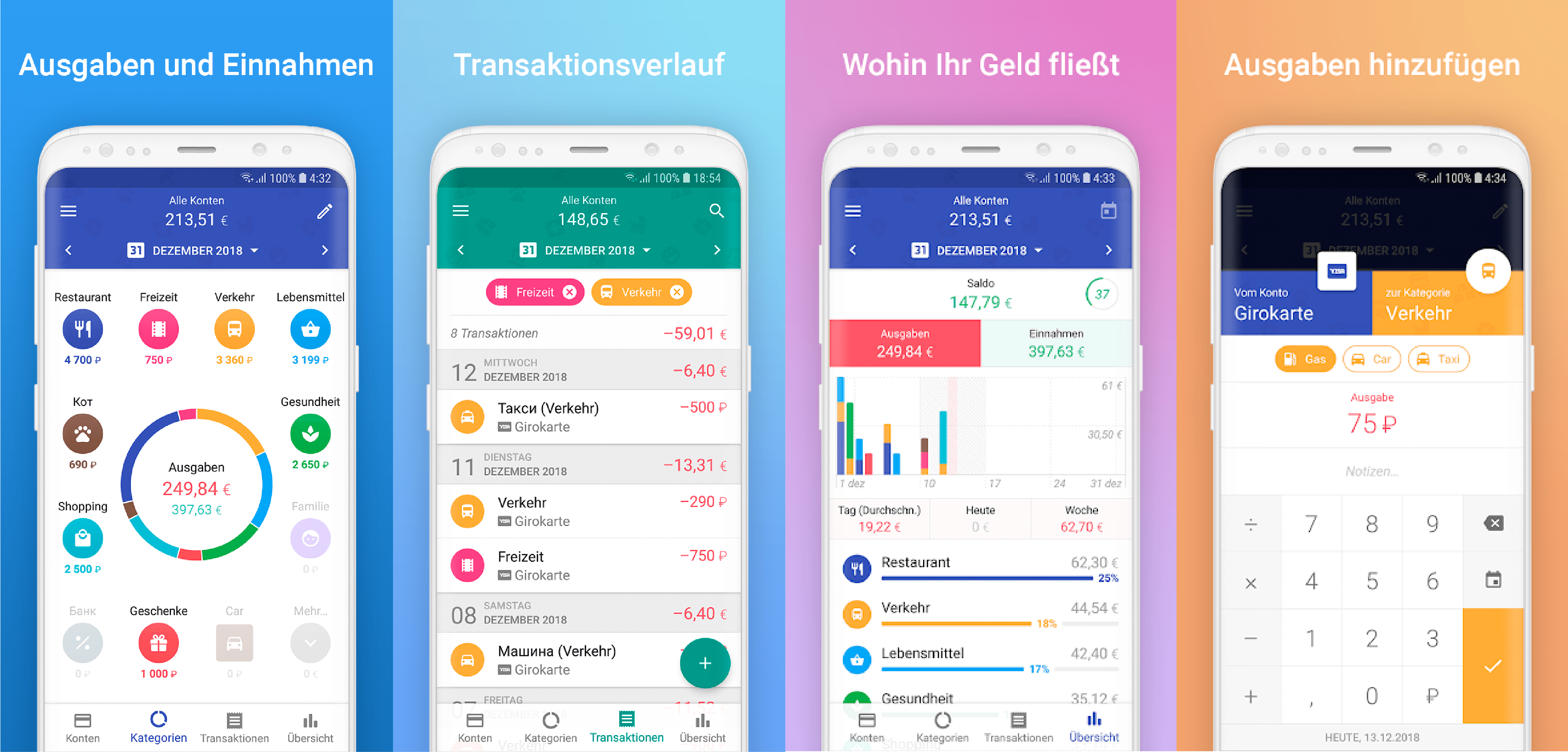
Old Application: 1Money
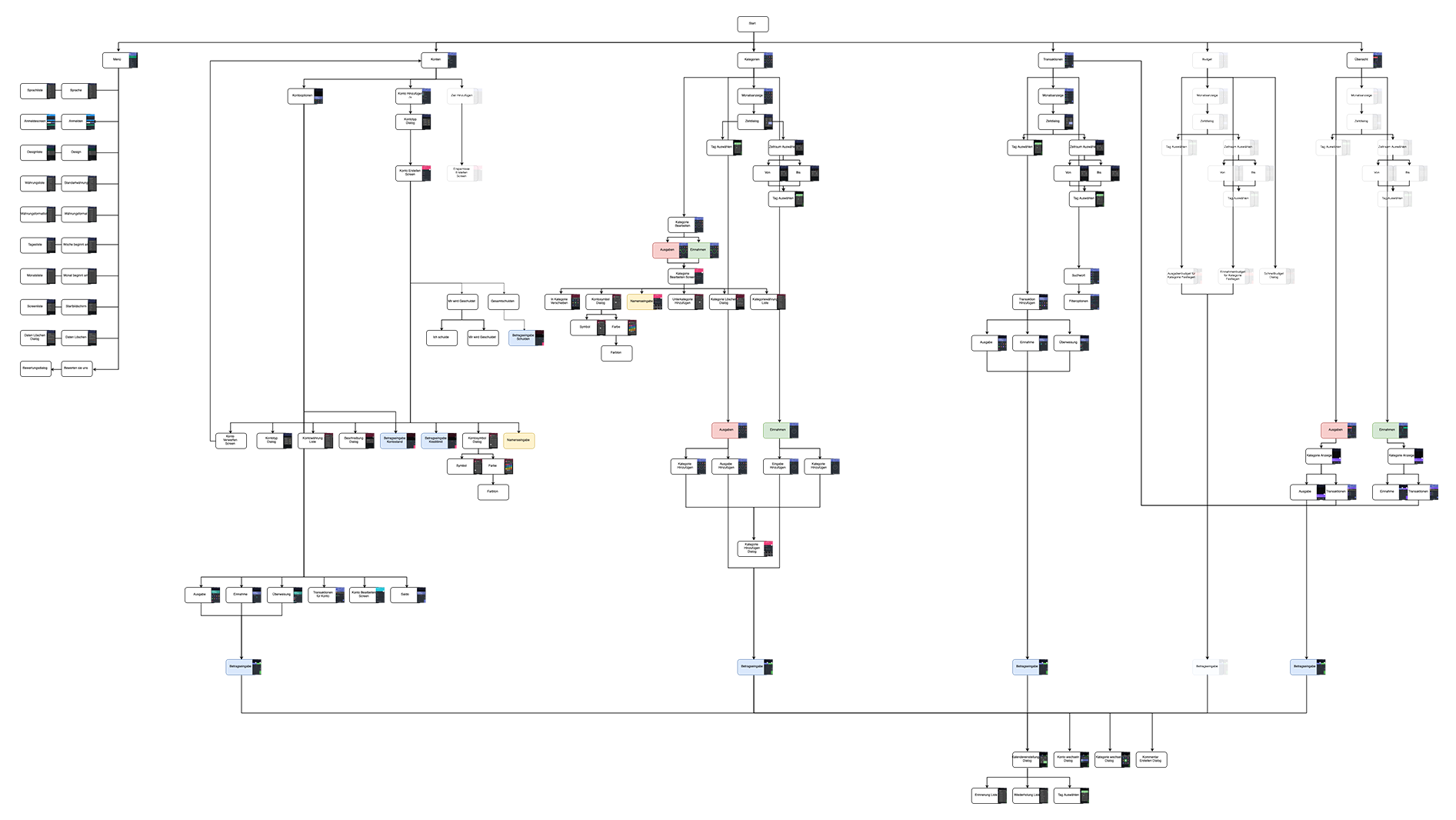
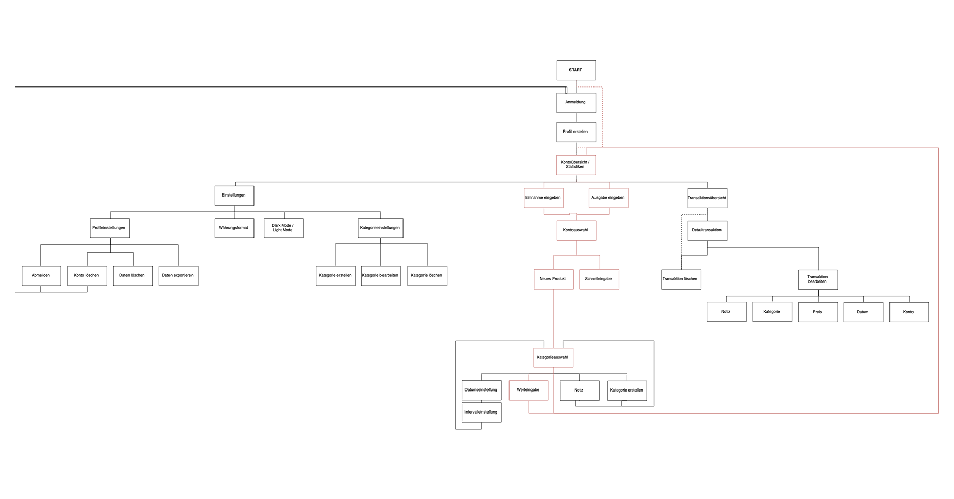
For a thorough analysis of the current processes we divided each of the users tasks into smaller steps and visualised the current functions in an information architecture.
Market Analysis
Our claim to the redesigned application was to have a unique selling point. For that we analysed various competing financial manager applications and noticed repeating patterns in the user interface: different variants of pie charts as hero element and a plus and minus button to enter the transactions. We particularly questioned these patterns and whether
Market Analysis
they actually are the best fit. Our key findings were that the new app needed to have a decluttered user interface with a limited use of color, shortcuts to make the user interaction more efficient and repeating entries faster and to make it more convenient to enter all of the important information.
Story Bits
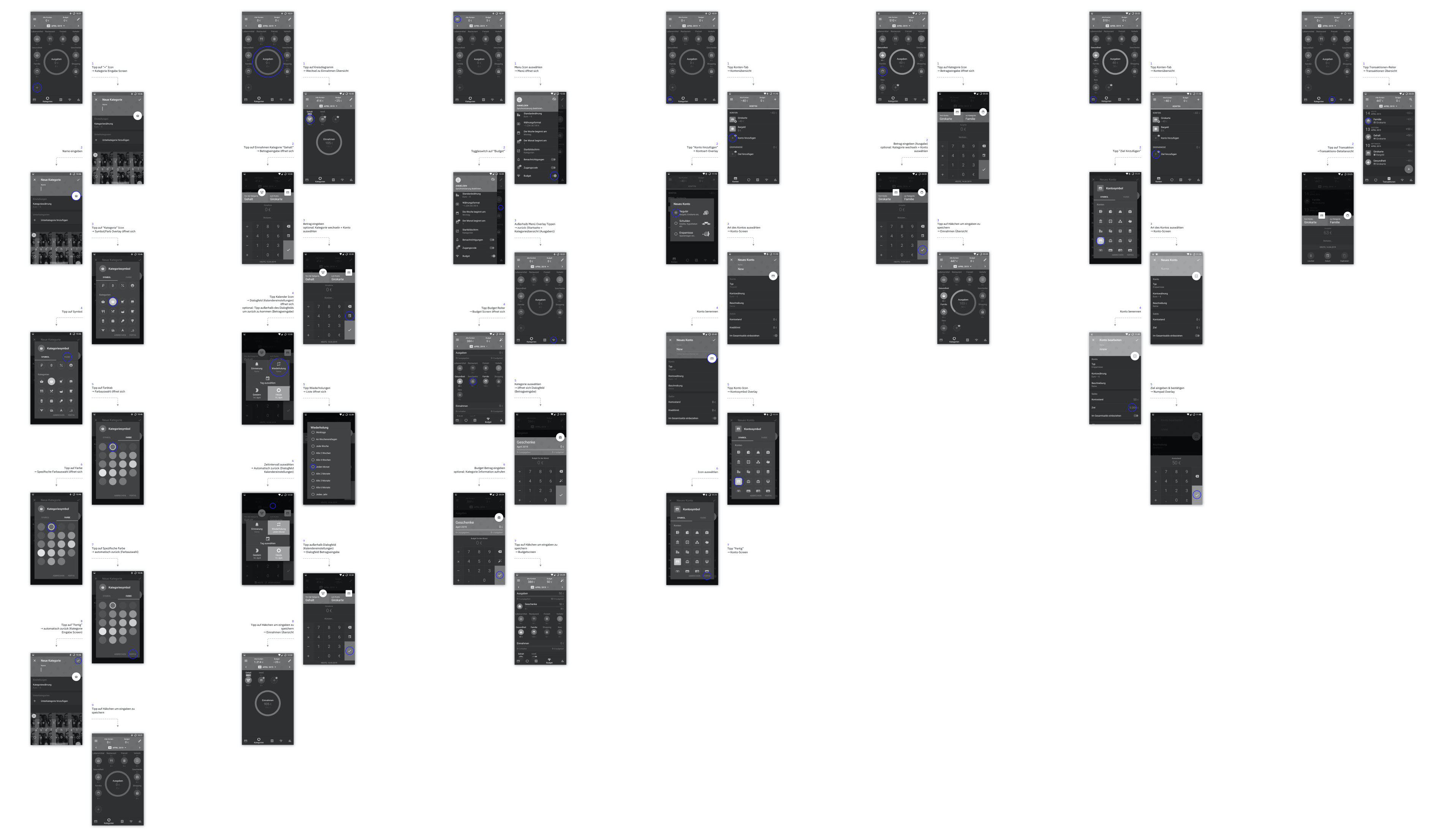
To compare the user’s needs with the functions in the applications, we created user stories. Each user story was then made into story bits, which we visualised with screen flows to have a good reference point for every improvement: Which processes are inconvenient for the user? Where are repeating steps which can be condensed?
Requirements
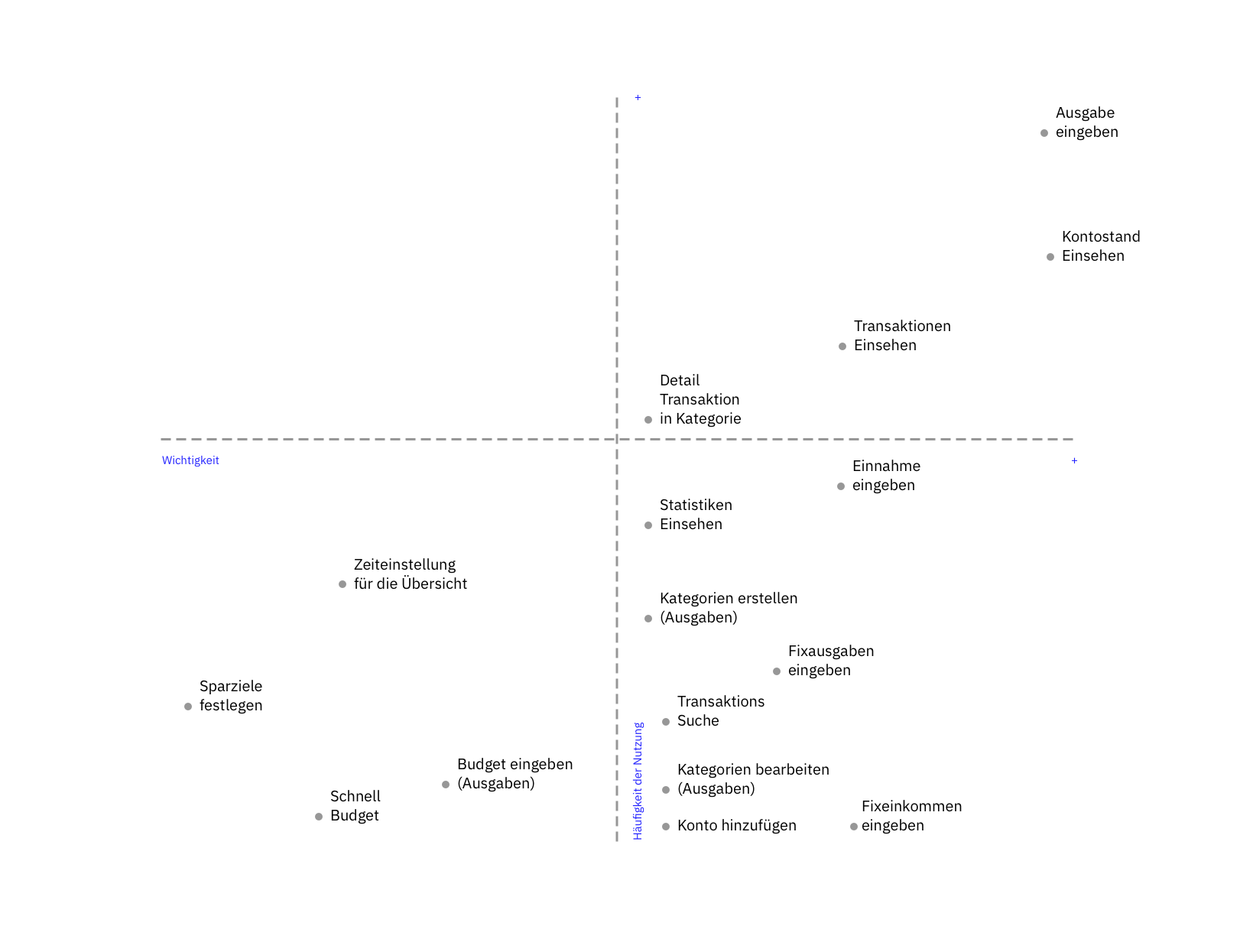
The functions were then classified in the visual and structural hierarchy through an axis map with frequency and importance as the factors by which they were rated.
We concluded the previous key findings in reqirements for the new application and confirmed intuitivity, clarity and flexibility as characteristics the new application should have.
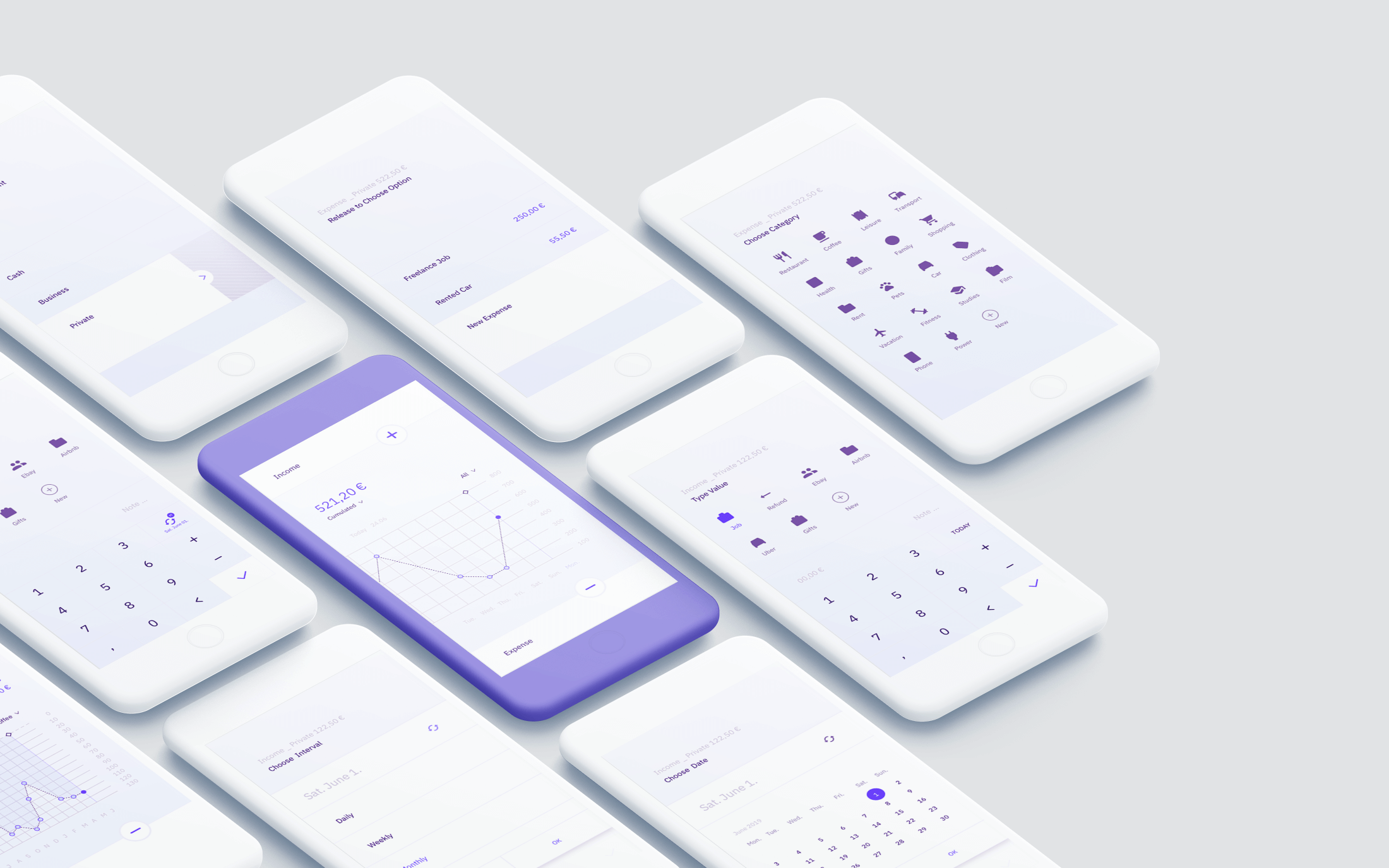
New Application: Wally
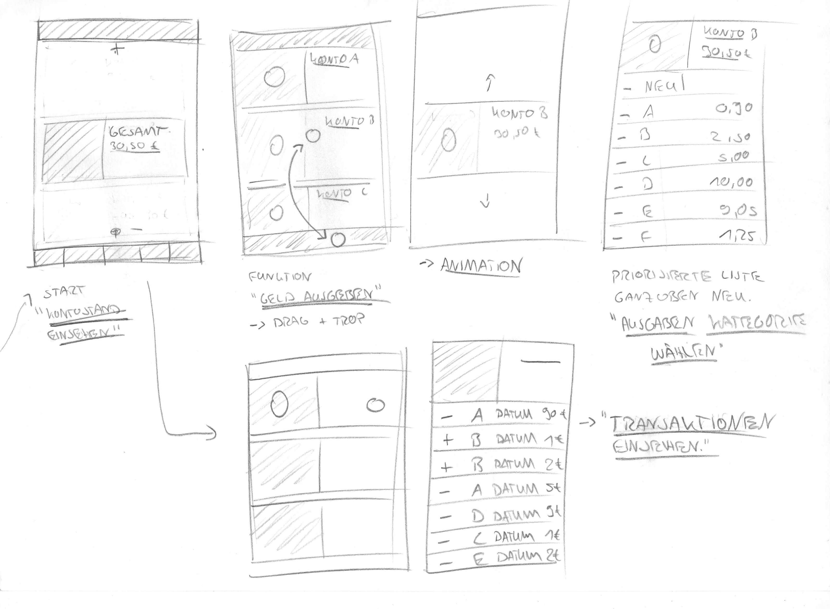
The two main functions are the input of the income and expenses and the overview over already entered information. The information layer should be the hero element of the main screen and give the user direct feedback with every entered input, which should also happen on the main screen.
To enter information consistently we made a three-step drag and drop system. To determine if the input is an expense or an income, the user drags the buttons in the direction in which he would give or receive money. Up or away from the user is an expense, down or towards the user is an income.
The second step is to choose the account which was used for the transaction, which works through dragging the button further over the listed accounts to the right edge of the screen. This will change the input options to the product choice, where the user drops the button to end the interaction.
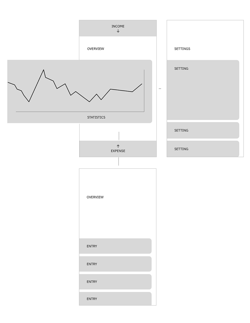
Information Architecture
For the redesigned application the functions were simplified and condensed. The interactions are way shorter, more efficient and user friendly. In the new information architecture, we also highlighted the direct way to achieve the users primary goals.
Screens
We united our findings from the previous phases and created wireframes. Since we decided on the statistics as our hero element, they needed to be as realistic as possible. Therefore we used real data, generated a CSV and visualised it in Tableau Public. This way we could make sure that the way we portray the statistics is actually practical for the day, week and year view as well as detailed information about different categories.
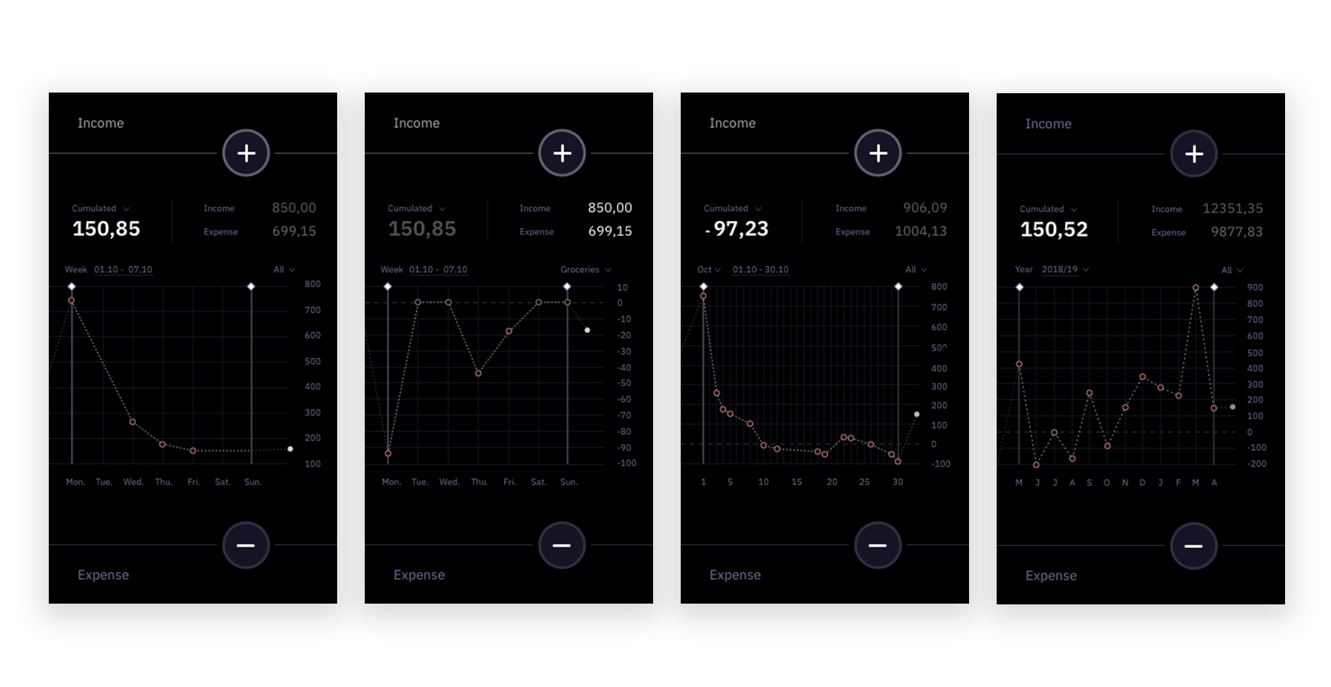
Design
The first variant was made in night mode, but this was not high enough in contrast to be used regularly and in the daylight, so we switched to light mode as default for a more ergonomical interaction. The night mode should be available in the settings.
Often used accounts and the option to insert a new product were placed in the same position so the users finger can reach them immediately. The drag and drop interaction ends after three steps to make sure there is enough time for the following, longer interactions and that the user can stop the interaction without losing to much progress.

Tools
