AirDesk - projected workspace
UX & UI
AirDesk is a projected workspace designed to combine the advantages of analog and digital work, while allowing multitouch as well as hand gestures for an intuitive and ergonomical user interaction.
Invention Design is about emerging technologies and their potential for future user interactions. We built our concept around laser projectors which project a sharp and visible touch screen onto any given surface.
Course
Invention Design
Supervisor
Timeframe
Semester 3
Project Partners
Research
After interviewing an organisational coach and creating user journeys for different user groups and how they use their workspaces, we focused on people working in creative fields as our main users.
Research
We collected ideas for possible functions the workspace could have and different ways to prototype them for users to try them out. Then we defined three key functions:
- collaborative working either locally or remotely
- multiple workspaces / projects
- communication between different devices
Technology
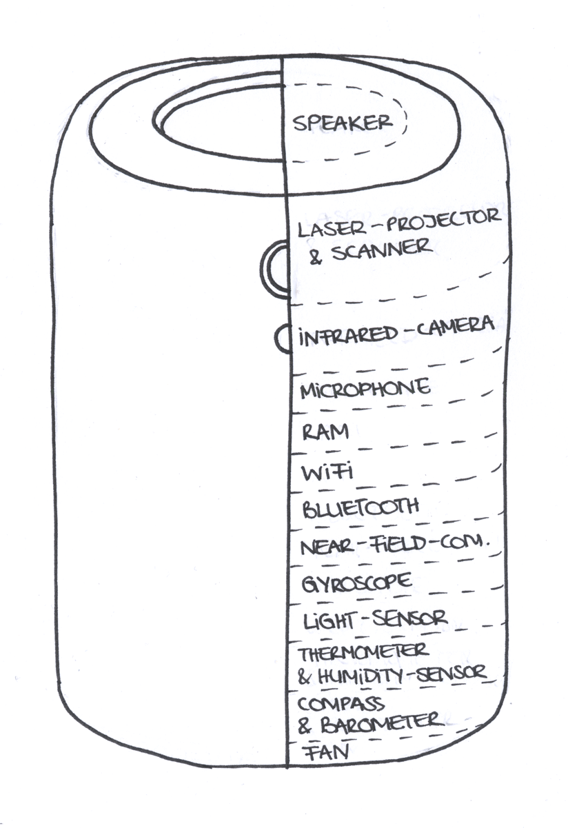
The technology in our projectors should consist of a future version of the Bosch BML050 MEMS Scanner, which is a focus-free laser projection module containing a scanner to recognize finger movement and touch gestures. This works through a detection of changes in brightness and by the same principle it would also be able to read the brightness levels of the surface and scan e.g. documents.
To prevent shadows in the projection the user will place two projection units facing each other on the two opposite edges of the desired projection surface. The projectors will calculate the available space and adapt the projection size flexibly.
An infrared camera will detect the number of users around the projection and their different hand gestures to enable ergonomical and natural user interactions.
Functions
To decide which functions to actually implement we created an axis map with frequency and importance as the factors by which they were rated.
Then we collected a list of control elements through which the user interacts with the workspace and assigned them various gestures. To assess which gestures are the most intuitive and have the highest fault tolerance, we conducted a testing.
For the concept to be thoroughly understandable we applied the functions in user scenarios. Therefore we chose representative applications for our user group:
- mind mapping tool
- sketchbook
- document scanner
- data exchange
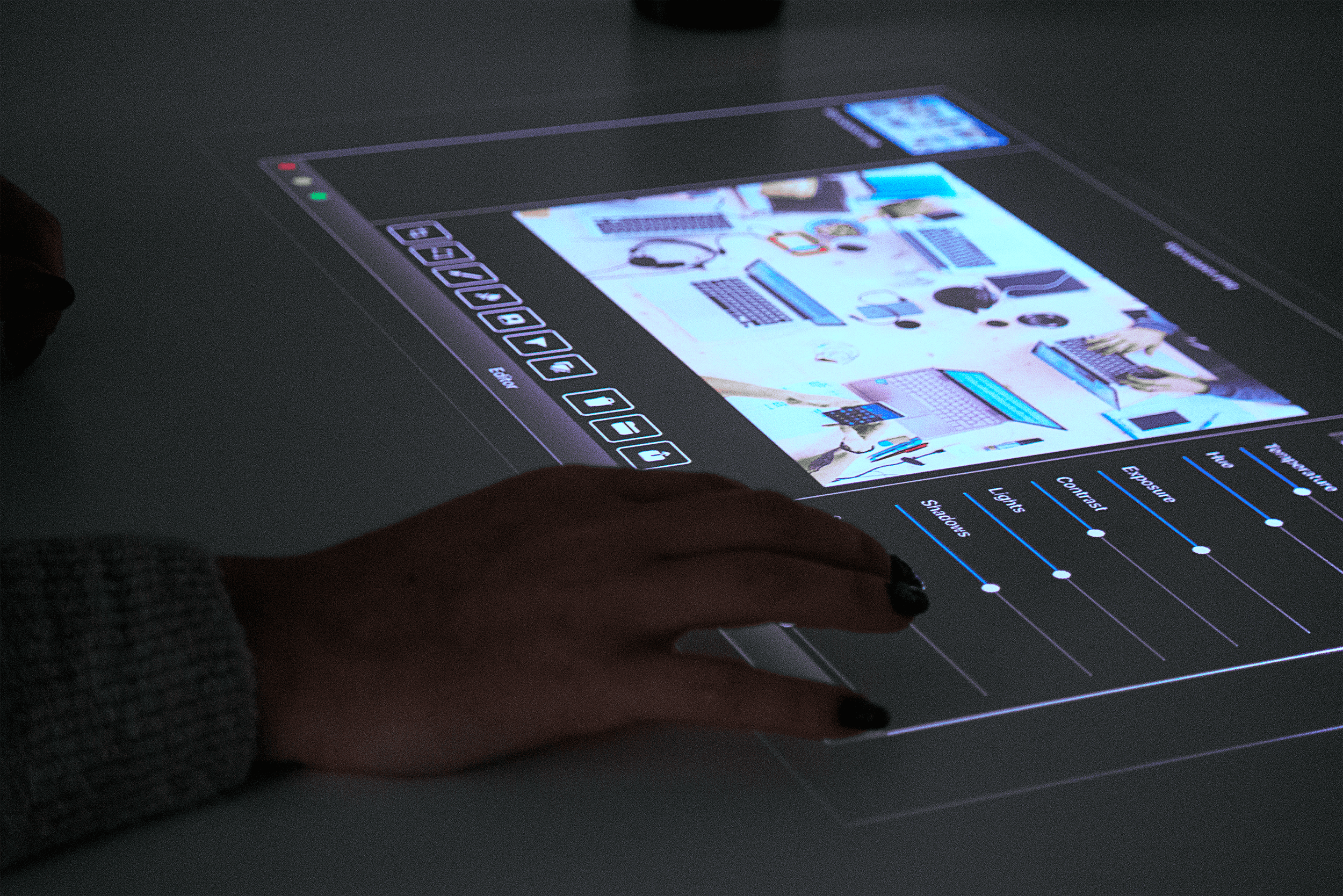
- picture editing
- workspace overview
- dock
Operating System
We decided on Apple as fictional employer. Still we created a completely new device, thus we also needed to create a new operating system which should resemble macOS and iOS.

Interface
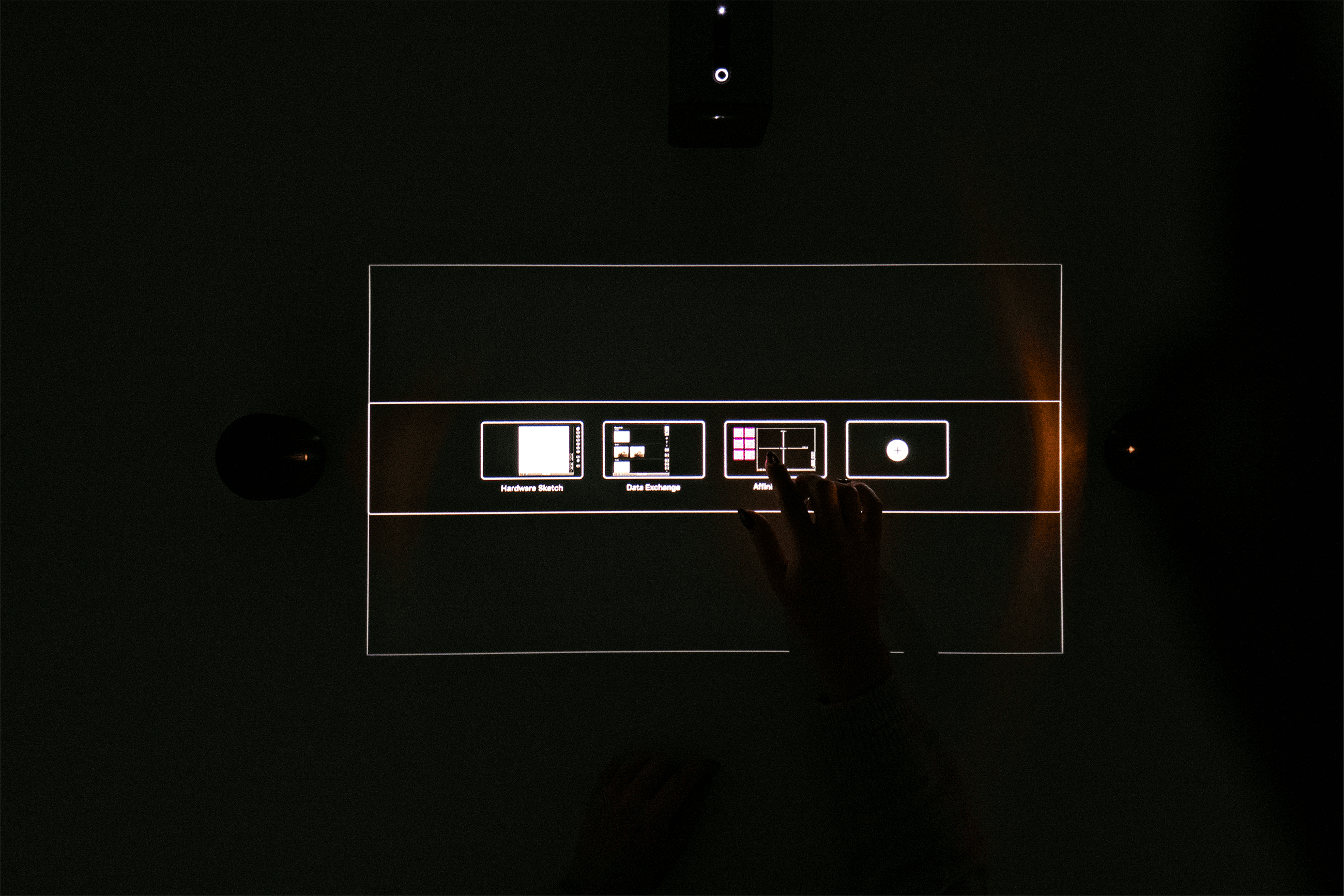
Working with light instead of pixels required us to carry out a color study to get the right contrast and to find out which colors would complement each other best. To maximise contrast most of the interface is black and white. The buttons and icons were increased in size and made square, hence optimized for touch interaction.
Interface
In many iterations we tested border sizes, font sizes and readability on a table-sized projection and a different projector which we would use for the final exhibition. The interface must work while one or more users are sitting in front of the projection or standing over it or even if they mount their projectors onto a wall.
Ergonomics
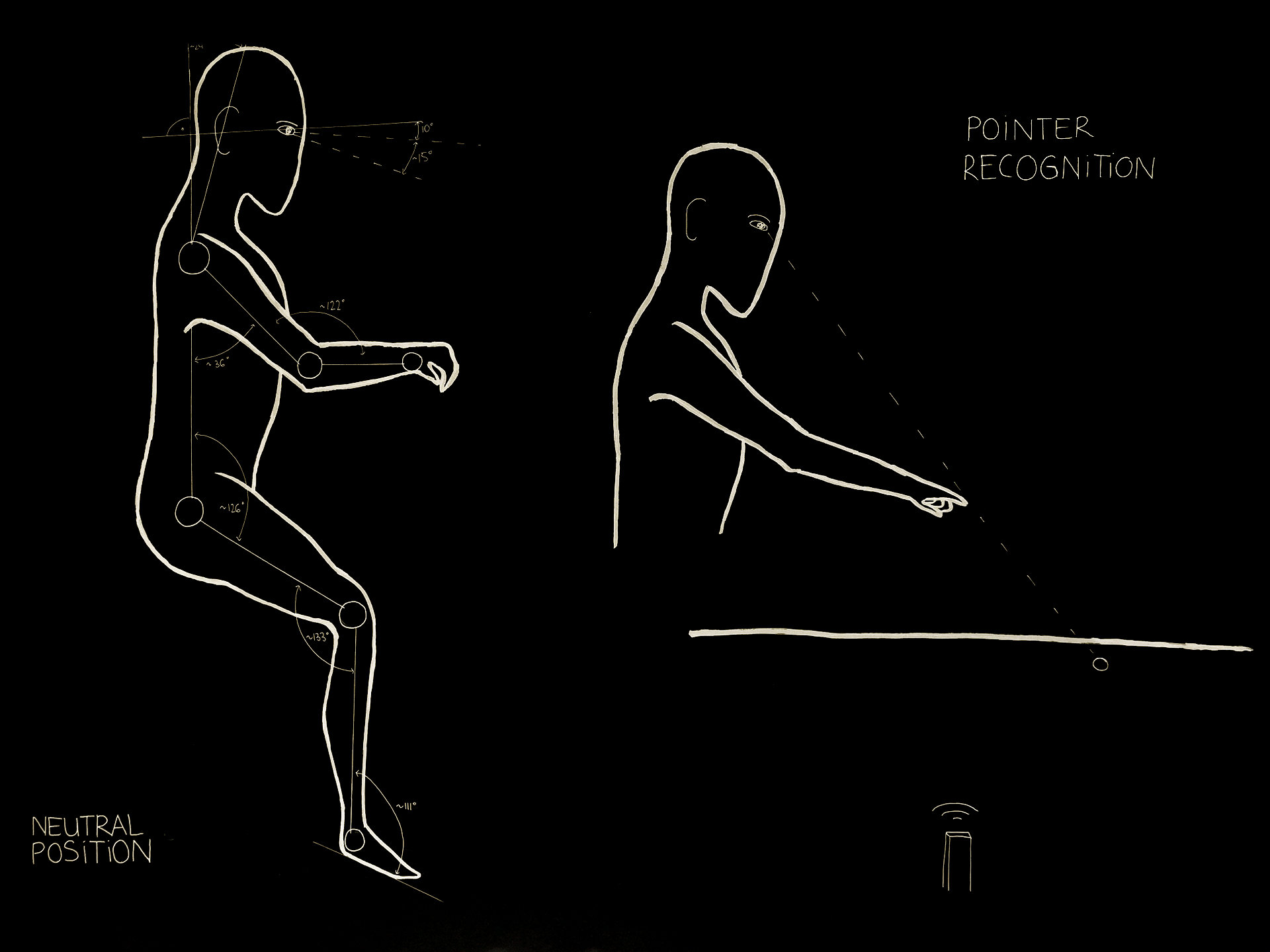
An ergonomic and flexible workspace is the cornerstone to a productive and healthy way of working, so we integrated the knowledge I gained from a one week long seminar with Eran Franco, a physiotherapist, ergonomist, accessibility audit and lecturer from Israel.
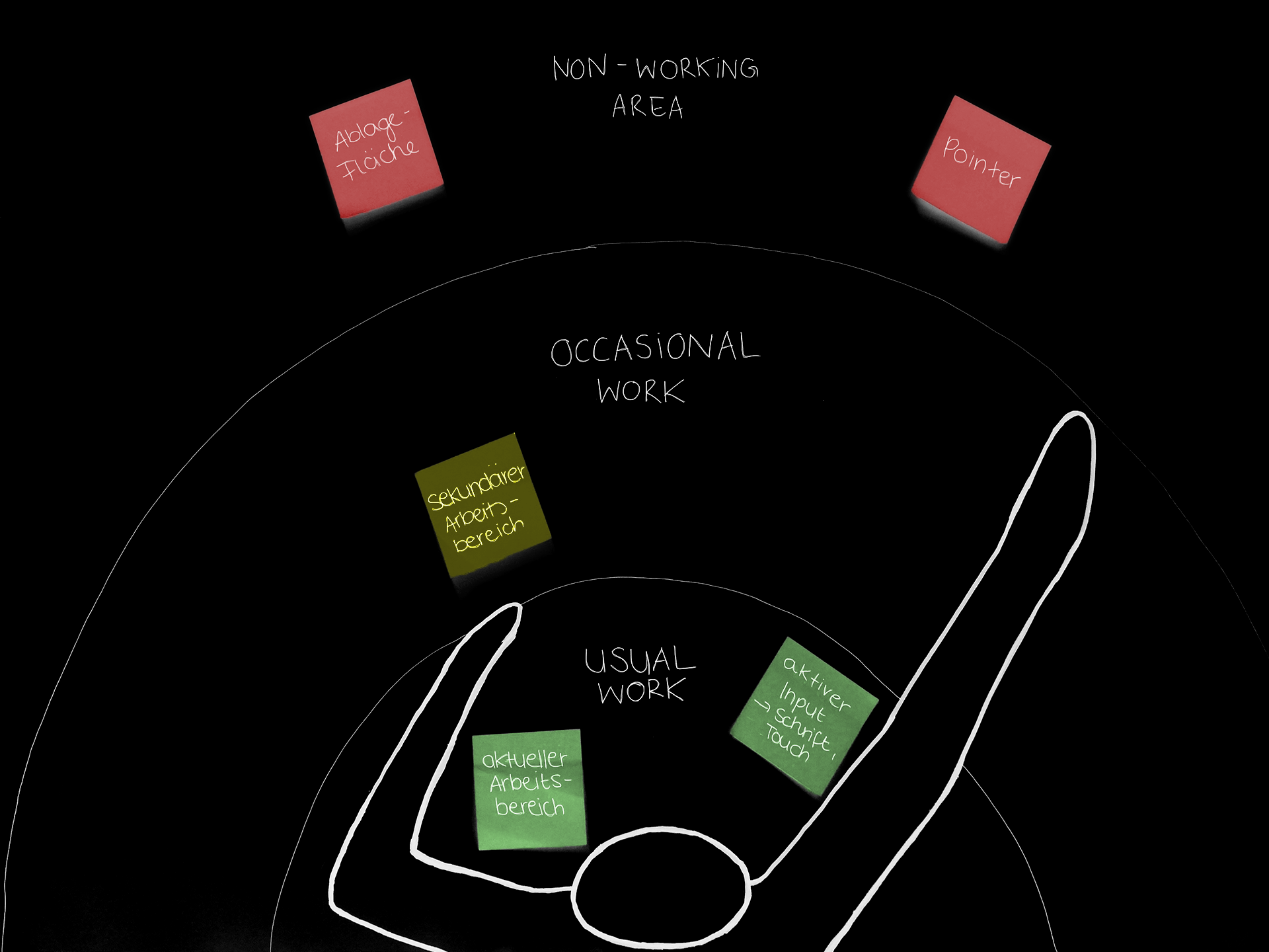
The user has three different working areas in his workspace, the first being the usual working area which he can reach while his body stays in the neutral position. Active applications, finger and pen interactions and the menu bar are located in this area.
To access the non-working area in an ergonomical way, the user can point his finger and interact through hand gestures. This area is for filed or minimized elements. We determined the borders by conducting reach studies with users of different heights.
Exhibition
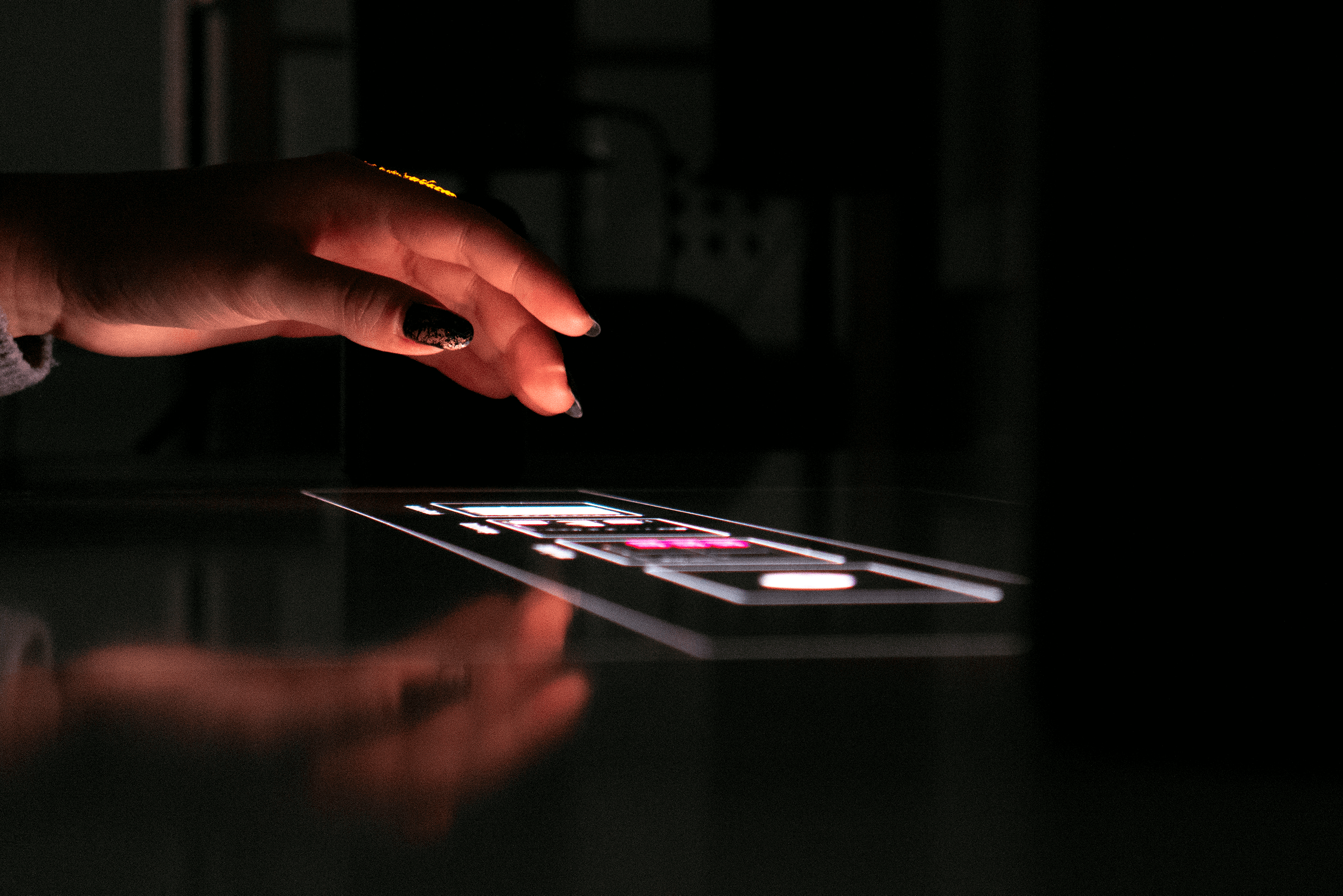
For the final exhibition we built two prototypes. The first version should communicate our concept in depth with the most important functions and gestures. We decided to film a concept video with the help of Max Walter as director of photography.
The second version should make the concept and interactions tangible. For that we used already existing technology, namely the Sony Xperia Touch projector, to create a clickable prototype to be tried out at the final exhibition.
Mockup
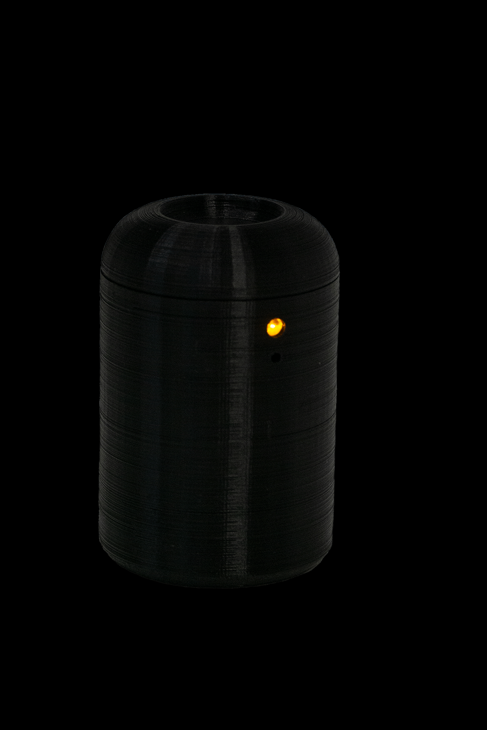
Without hardware mockups it is hard to get the whole experience, so we 3D printed two projector cases. The mockups had to be simple and not leave any room for questions, since they shouldn’t distract from the interface.
Tools
